Change in Motion
The Brief
E-scooters faced a severe reputation problem in the UK. Rental services like Lime and Bird had flooded cities with scooters that ended up abandoned in canals and blocking pedestrian pathways, creating public backlash. Media coverage was negative, and the entire category became tainted before premium personal scooters entered the market.
The challenge transcended simple naming — it required rehabilitating an entire product category's perception. The brand needed to reposition e-scooters from pavement clutter associated with reckless riders into something design-conscious adults would willingly use.
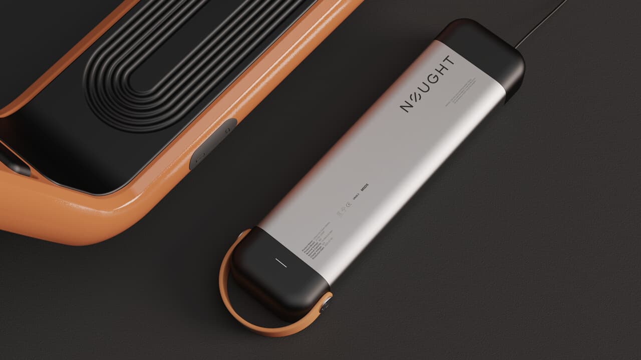
The client had engineered a genuinely superior product: UK-designed, fully integrated system featuring swappable batteries, tubeless tires, integrated locks, and minimal storage footprint. The missing element was a brand powerful enough to shift consumer perception.
Foundations
This British company was founded by e-scooter pioneers who had built their user research and prototyping foundation before mainstream adoption. Their product was objectively best-in-class: faster, lighter, sleeker, safer, and smarter than competitors, with fully integrated system design rather than assembled components.
Purpose: Prove that micro-mobility represents the smarter, faster, cheaper, greener urban transportation alternative to cars, buses, and trains.
Vision: A world where sustainable private transport dominates micro-journeys, where owning your commute becomes the norm, where the optimal journey between two city points is also the most enjoyable.
The company's entire positioning aligned around one direction: design-led, premium, considered, forward-thinking, minimal.
Greener cities start with first-movers.
Audience
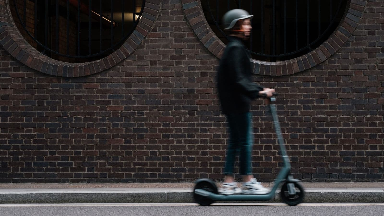
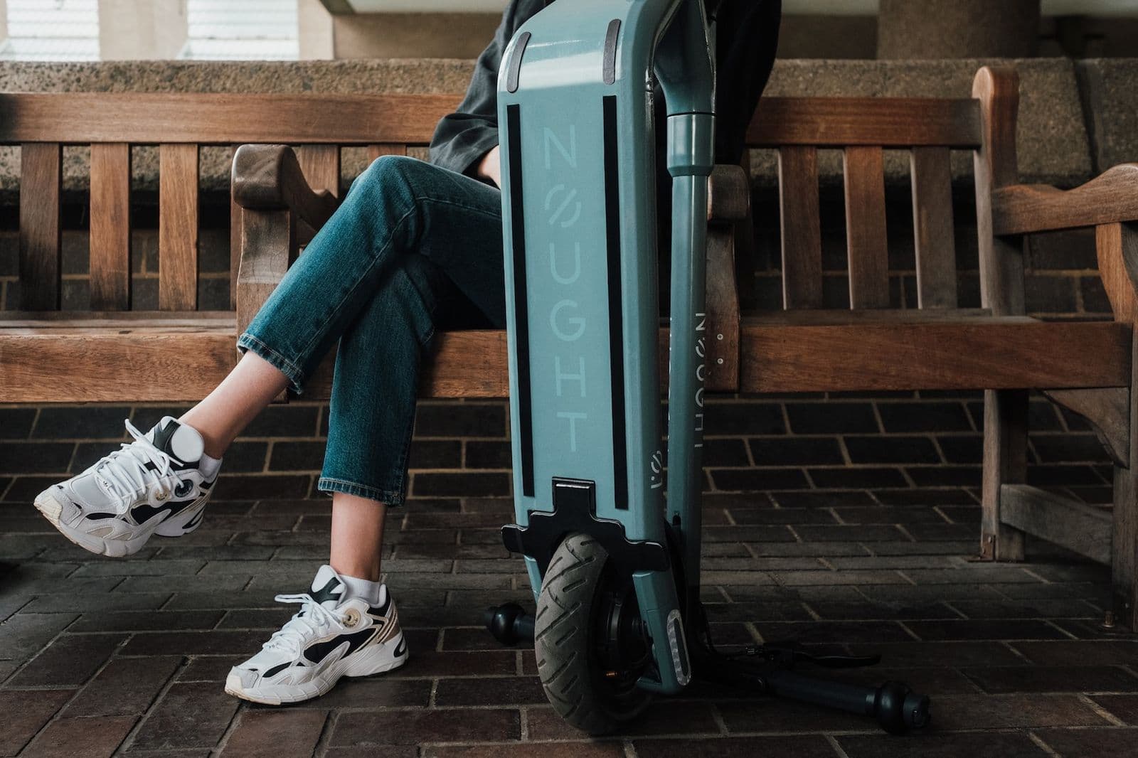
Urban commuters exhausted with conventional city transportation. They're trapped in traffic, crowded on subways, waiting for unreliable buses, or arriving sweaty from cycling. They recognise better alternatives exist but haven't encountered one compelling enough to warrant switching.
These aren't early-adopter tech enthusiasts. They're design-conscious, environmentally aware consumers willing to pay premiums for genuinely superior products — functionally and aesthetically. Their purchasing patterns reflect this: Cowboy bikes, Aesop soap, Apple products. They're intentional about how they navigate their environment and what their consumption choices communicate.
The brand needed to transform daily commutes into experiences people actually anticipate.
The transformation:
- Frustrated → Free
- Stuck → Moving
- Passive → Exploring
- Commuting → Experiencing
Landscape
The e-scooter market exhibited extreme polarisation, leaving the premium segment completely underserved.
Budget segment: Brands like Xiaomi and Pure Electric offered functional, affordable scooters with zero brand equity. Marketing relied on product renders against white backgrounds and specification comparison tables. This segment competed purely on price and technical specs but built no lasting brand value.
Shared mobility: Lime and Bird achieved visibility while simultaneously associating scooters with disposability, messiness, and public nuisance. Every abandoned rental scooter reinforced negative category perception.
Premium segment: Completely empty. Cowboy and VanMoof had successfully claimed premium positioning within e-bikes, demonstrating that electric mobility could command premium pricing when wrapped in genuine brand strategy. No competitor had translated this approach to scooters.
Now you don't have to stop to smell the roses.
Strategy
The foundational strategic insight flipped conventional category positioning: don't sell what the scooter is — sell what it removes.
Every competitor used additive messaging — more features, specs, range, speed. They piled benefits onto a product consumers already questioned. Nought inverted this approach. The name itself becomes the strategy: zero. Nothing. The absence of everything making urban transportation miserable.
Zero emissions. Zero bumper-to-bumper traffic. Zero bus waiting. Zero sweaty cycling. Zero crammed subways. Zero late trains. Zero compromises.
This messaging architecture allowed every communication element to ladder back to something Nought eliminates — not what the scooter provides, but what disappears when riding one.
However, removal alone lacks aspiration. The strategic counterweight adds experiential presence: riding Nought isn't merely avoiding bad commuting — it's actively experiencing something genuinely enjoyable.
Identity
The brand archetype combines Explorer and Creator characteristics.
The Explorer represents the restless pull toward urban environments and their entirety. It's the difference between commuting through London versus experiencing London — between tunnel vision on subways and watching the city unfold around you at street level.
The Creator embodies design obsession. The product philosophy treating e-scooters as considered furniture — integrated, minimal, premium, beautiful. Every feature exists by design, not attachment. The Creator removes rather than adds, refining toward essential elements.
Five core values:
- Design-Led — Research-informed, consumer-focused design delivering market-leading experience through function expressed beautifully.
- Integrated — Full-service product philosophy with no tack-on accessories. One seamlessly connected ecosystem.
- Premium — Best appearance, feel, and ride quality. Premium represents a standard, not a price point.
- Eco-Conscious — Zero emissions as core principle rather than marketing angle.
- Progressive — Continuous electric movement advancement rather than market-following.
Small rides for big cities.
Finding the name
Nought functions as strategy compressed into a single word. The name means zero — the brand's most potent message. Zero emissions. Zero waiting. Zero compromise. Every negative aspect of traditional transportation that the scooter eliminates is embedded in the name before any supporting copy registers.
The term carries character beyond clinical meaning. It's British, subtly unexpected, and radiates quiet confidence. Unlike category competitors shouting speed and range, Nought communicates something more sophisticated: everything frustrating about getting around? Gone.
The name establishes intuitive product-naming conventions. The Nought.One represents more than a model designation — it's a statement. The inaugural product in a line starting from zero, building only essential elements.
More case studies


Get a free Brand Strategy Snapshot
Get a taste of the strategic work we deliver in our paid packages, completely free. Answer a few questions and we’ll show you what most brands never figure out.