Art that answers to your walls
The Brief
Finding wall art that matches existing colour schemes is a specific pain point in interior design. You open a print marketplace and scroll through ten thousand prints searching for the right shade rather than the right composition.
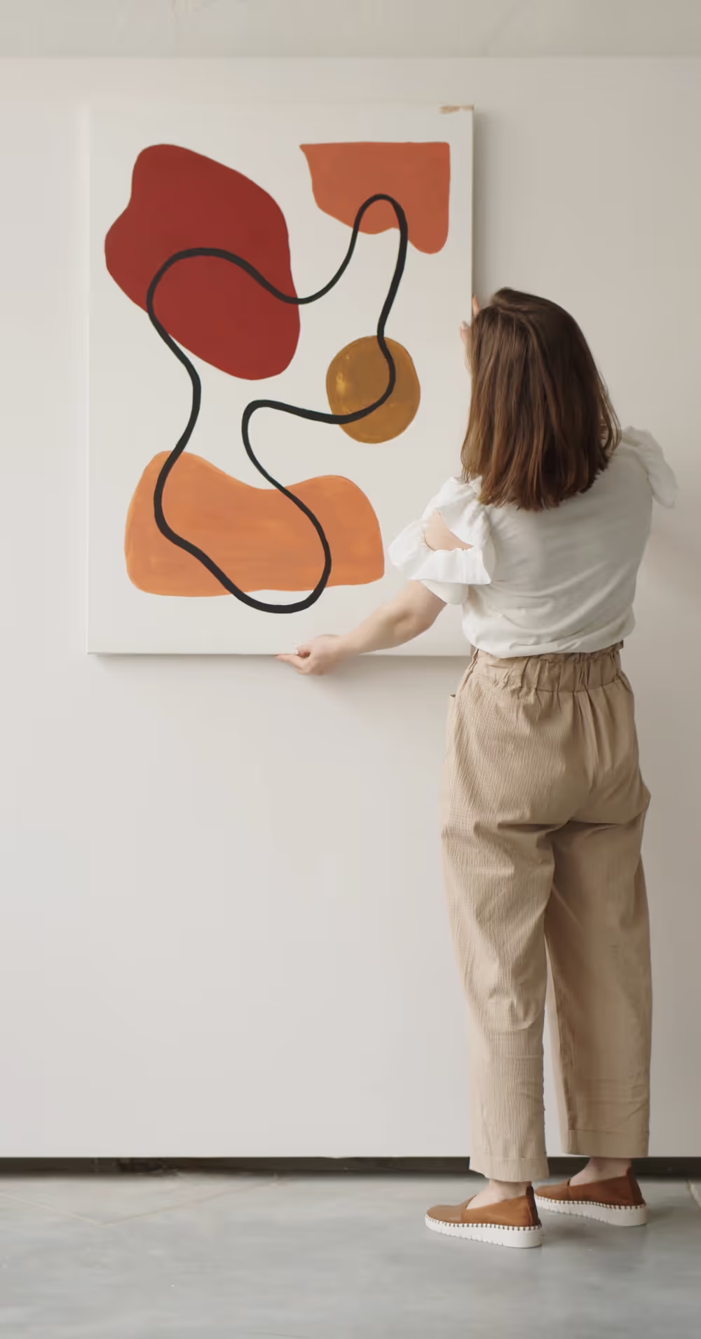
Bask's innovation centres on inverting the typical purchase decision. Instead of offering filtered preset adjustments, the platform enables element-by-element colour customisation — customers select compositions first, then tune individual design elements to match their specific spaces.
The gap between art people love and spaces they've designed. Generic wall art functions as an afterthought rather than intentional design.
Foundations
Purpose: Close the alignment gap between art palettes and room palettes. Most wall art fails because these aesthetic systems don't synchronise.
Mission: Build a platform where curated compositions — illustrations, typography, photography, abstracts — are designed for element-level colour customisation, printed on-demand, and delivered ready to hang.
Vision: A world where wall art is never a compromise — eliminate settling for approximations by creating prints literally made for specific rooms.
The real problem wasn't a lack of art. It was a lack of fit.
The real problem wasn't a lack of art. It was a lack of fit.
Audience
Design-conscious homeowners and renters, ages 25–45, primarily urban and suburban, digitally fluent. They spend significant time curating interior spaces — deliberating over colour selection and fabric choices. They follow interior design accounts on Instagram and Pinterest. They understand colour theory and spatial harmony.
They're not art collectors or investors. They're pragmatic aesthetes who leave marketplaces frustrated, scrolling through hundreds of prints trying to find something in the right colour rather than the right composition.
They want art that ties a room together without undermining existing design choices.
Landscape
Volume tier (Desenio): Massive affordable catalogues with trend-driven collections. Styled room mockups and social media marketing. Fundamentally passive: browse what exists and hope something fits.
Mid-market (Society6, Redbubble, Juniqe): Artist-driven marketplaces with enormous range. Inconsistent quality control. Still rely on browsing rather than curation. No sophisticated customisation.
Premium tier (King & McGaw, Artfinder): Higher-quality reproductions and original works. Price points position them differently entirely. None offer meaningful colour customisation.
Between affordable poster shops and gallery-priced originals exists an underserved audience wanting considered, well-designed art that actually matched their interiors.
Bask didn't need to compete on price or catalogue size. It needed to compete on a dimension that didn't exist yet: fit.
Art that answers to your walls.
Strategy
The central strategic reframe repositions Bask outside the traditional art market. Rather than competing on aesthetic taste or artist reputation, it solves an interior design mechanics problem other platforms leave to customers.
People purchase wall art not from aesthetic passion but from functional need. They buy it because they need something for a specific wall in a specific room with a specific colour scheme.
Product architecture: Artists upload layered compositions. Each layer remains independently colour-adjustable. Customers see real-time preview as they adjust elements. Results are genuinely unique pieces, not filtered variations.
Five core values:
- Intentional — No accidents, no settling; every print chosen then customised.
- Curated — Edited collection over exhaustive catalogue; gallery approach.
- Personal — Shared composition, owned palette; two customers buy identical designs but receive different pieces.
- Crafted — Archival-quality paper, pigment inks, print-to-order production.
- Warm — Creates "lived in" rather than "decorated" feeling; sensory completeness.
Identity
Brand archetype: Intersection of Creator and Lover.
Creator dimension: Represents design intelligence and creative empowerment. The colour customiser functions as a creative instrument, not a shopping tool. It respects customer expertise and provides execution means.
Lover dimension: Captures the sensory and emotional experience of completed rooms. Recognises art purchase as emotional rather than rational transaction. Expresses the warmth of light on walls and the feeling of home.
Brand voice: Warm, confident, design-literate without pretension. Speaks to knowledgeable customers rather than educating taste. Operates as a knowledgeable friend who happens to have great taste.
Walls worth Basking in.
Finding the name
To bask: to lie in warmth; to soak in light and colour.
The name describes the outcome — how customers feel in completed rooms — rather than the mechanism. It evokes sunlight, warmth, colour, comfort while maintaining lifestyle brand positioning rather than tech or art marketplace associations.
No direct references to print, art, colour, or composition. No forced compound words or clever portmanteaus. A warm, single-syllable English word that everyone already knows and nobody else has claimed.
Moving from functional description to aspirational outcome creates stronger market position.
More case studies


Get a free Brand Strategy Snapshot
Get a taste of the strategic work we deliver in our paid packages, completely free. Answer a few questions and we’ll show you what most brands never figure out.